Systemic Fear Not As High As It Once Was
Why was the stock market able to break out of the 13-year consolidation pattern we covered last Friday? The bigger picture answer may lie in the answers to these five sub-questions:
- Does economic data support an imminent recession?
- Is Europe on the brink of a currency crisis?
- Are the technicals screaming 'be careful'?
- Is the Fed apt to remove monetary stimulus too quickly?
- Does the political gridlock in Washington appear to be worsening?
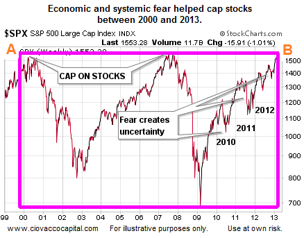
When the S&P 500 was capped between point A (2000) and point B (2013), the answers to the five questions above were much more uncertain and bearish than they are today.
Is A Recession Imminent?
Bear markets usually coincide with a contracting economy. Therefore, if we are expecting an imminent bear market in stocks, we would also expect economic contraction to be imminent. The most recent big-picture read on the U.S. economy came in the form of the December GDP report. The data did not imply a recession is close at hand. From CNN:
Gross domestic product — the broadest measure of economic activity — grew at a 4.1% annual pace in the third quarter, up from the 2.8% pace that was first reported in November. It was the fastest quarter for economic growth in two years, according to the Bureau of Economic Analysis.
Monday brought some good news from the always important housing sector. From Reuters:
Contracts to purchase previously owned U.S. homes edged up in November, marking the first increase in six months and providing a hopeful sign the sector has begun to stabilize after its momentum was sapped by rising mortgage rates. “We may have reached a cyclical low because the positive fundamentals of job creation and household formation are likely to foster a fairly stable level of contract activity in 2014,” said NAR chief economist Lawrence Yun.
Is Europe On The Verge Of A Collapse?
If we would have posed the question above in 2010 or 2011, the answer may have been “it may be”. A recent update from the European Central Bank tells us things are not as bad as they once were. From The Wall Street Journal:
The euro zone’s financial system is on much firmer footing than it was following the intensification of the sovereign debt crisis over two years ago. In its report, the ECB said that “measures of systemic stress in the banking sector have declined markedly since the peaks that followed the intensification of the sovereign debt crisis in mid-2011.” Moreover, “a broad composite measure of systemic stress across major euro area financial asset classes has fallen even further, to lows not seen since global financial strains first emerged in the summer of 2007.”
Are The Technicals Screaming Be Careful?
This week’s stock market outlook video answers the question above by examining the S&P 500’s weekly trend, and three key risk-on vs. risk-off ratios:
After you click play, use the button in the lower-right corner of the video player to view in full-screen mode. Hit Esc to exit full-screen mode.
Will The Fed Change Policy Too Rapidly?
The financial markets became obsessed with the term “taper” after Ben Bernanke implied the Fed may become less accommodative in May. The dreaded taper announcement finally came on December 18. Since then, the S&P 500 has gained 30 points. Part of the positive reaction from stocks was based on the Fed’s promise to keep rates low. From the December 18 policy statement:
To support continued progress toward maximum employment and price stability, the Committee today reaffirmed its view that a highly accommodative stance of monetary policy will remain appropriate for a considerable time after the asset purchase program ends and the economic recovery strengthens.
Is Political Gridlock in Washington Getting Worse?
Experienced investors are familiar with the fear caused by the fiscal cliff and numerous partisan budget battles in the last three years. In a recent interview on Financial Sense Newshour, Kim Wallace, senior advisor and Head of Washington Policy at Renaissance Macro Research, was asked about the significance of the recent budget deal made in Washington and what it means for the market:
I think it’s a bigger deal for the markets than what we’re willing to give credit for…In terms of practical work here in Washington, it’s healthy I think for the process that you’ve returned to what we call “regular order”. That is, the budget committees got together and passed budget resolutions from both bodies for the first time I believe in seven, maybe nine, years. They were very two different documents. And although what they achieved in the budget conference was fiscally and economically insignificant (when you look at the numbers—clearly), it does allow more members…to be a part of the process.
Investment Implications - “Not As Bad” Is A First Step
Is the outlook for the economy, euro, interest rates, and political harmony 100% positive as we head into 2014? Absolutely not, but there is little question progress has been made. Before things can move into positive territory from a perception perspective, they often have to take a baby step into “not as bad as it once was” territory, which is exactly what we have seen with respect to the five questions. 
The observable evidence continues to call for a heavy allocation to growth-oriented stocks. Therefore, we continue to maintain exposure to U.S. equities (via Vanguard Total Stock Market ETF, (VTI)), technology (via PowerShares QQQ ETF, (QQQ)), financials (via the Financial Select Sector SPDR Fund, (XLF)), energy (via the SPDR Energy Select Sector Fund, (XLE)), small caps (via iShares Russell 2000 ETF, (IWM)), emerging markets (iShares MSCI Emerging Markets, (EEM)), China (iShares FTSE/Xinhua China 25 Index, (FXI)) and global stocks (Vanguard Total World Stock Index, (VT)). If investors learned one thing in 2013, it was that calling a stock market top is nearly impossible. If we pay attention to the market’s pricing mechanism, the market will tell us when changes are in order.
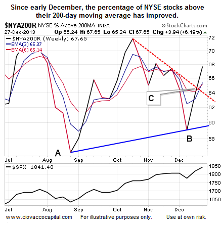
What do we mean by observable evidence? The charts shown in the video above are good examples. Another example is the improvement in market breadth shown in the chart below. Breadth speaks to the percentage of stocks participating in a market advance. Healthy markets tend to have broad participation. The chart shows the percentage of NYSE stocks above their 200-day moving average. The 200-day is used by market professionals to monitor the health of long-term trends. The indicator recently made a higher low (B is higher than A), which is a positive development. The downward-sloping red trendline was also broken recently in a bullish manner for the general stock market (see point C).
