We think these three emerging market countries (Malaysia, Philippines, and Thailand) offer better opportunity at this time than the emerging markets index, or the popularized BRIC countries (Brazil, Russia, India and China). Let’s see why.
Those three selections are in the group of emerging market countries with positive total returns for 10 years, 5 years, 3 years, 1 years, YTD and 3 months, while the BRIC countries have negative total returns for 5 years. Figure 1 based on MSCI index data makes that point.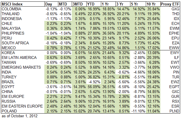
Of those in Figure 1 that had the better performance over all those periods, Figure 2 shows that the Malaysia ETF (EWM), the Philippines ETF (EPHE) and the Thailand ETF (THD) have better looking 1-year daily price performance relative to the Vanguard MSCI emerging markets index ETF (VWO). Figure 3 shows that the Brazil ETF (EWZ), Russia ETF (RSX), India ETF (PIN) and China ETF (GXC) have worse performance relative to the emerging markets index.
Figure 2: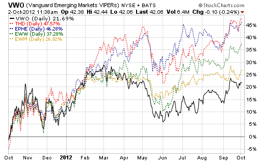
Figure 3: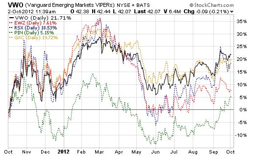
Figure 4 shows the weights of each of those seven countries within the MSCI index. The select countries are a small part of the overall index, so any allocation to them as individual country funds is likely to be a major overweight relative to their world market weight or emerging markets weight. The select countries are shaded in green.
Figure 4: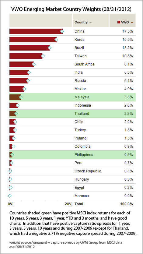
Figure 5 shows that the capture ratio spreads for the select countries are better for 1 year, 3 years and 5 years than the BRIC countries, and are positive for the period of 2007 – 2009, which included the market crash months.
China, India and Brazil have better capture spreads during 2007-2009 (Russia had a terrible capture spread), but the BRIC countries have had negative capture spreads over 1 year, 3 years and 5 years. See our previous article on how larger capture spread correlates with higher total returns.
Figure 5: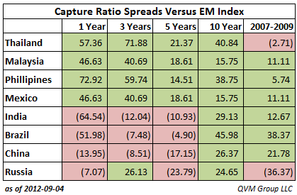
What Are Capture Ratio Spreads:
Capture ratios measure a fund’s performance in up and down markets relative to the benchmark market index (in this case we used the Vanguard emerging markets ETF as the benchmark). The ratio in this article is calculated by determining each month the size and direction of the price change for the S&P 500; then determining the size and direction of the price change for the same period for the fund being evaluated; and then dividing the size and direction of the subject fund by the size and direction of the benchmark index.
Higher ratios are better for the upside ratio, and lower ratios are better for the downside ratio The idea is to participate maximally in upside moves and minimally in downside moves.
The capture ratio spread is the upside capture ratio less the downside capture ratio.
Because the Thailand and Philippines ETFs do not have 10-year operating histories, it is helpful to look at the MSCI indexes for those countries, which have long histories. Figure 6 plots the MSCI total return of the select countries versus the MSCI emerging markets index. Figure 7 shows the BRIC country total returns against the emerging market index.
On a 10-year basis the BRIC countries have done better than the emerging markets index, and the select countries (except for Thailand) have underperformed. However, more recently, the select countries are trending up while the BRIC countries are trending down.
Figure 6: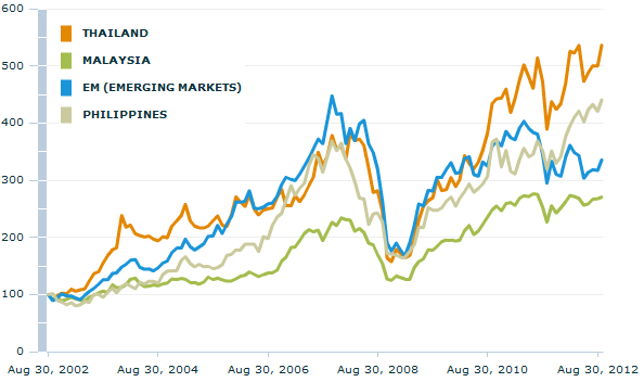
Figure 7: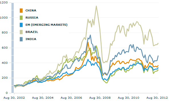
From a trailing yield perspective the select countries are broadly comparable to the BRIC countries, with Malaysia being the highest yielder.
Select country yields:
- THD 2.45%
- EWM 3.64%
- EPHE 1.04%
- EWZ 2.81%
- RSX 2.16%
- PIN 0.30%
- GXC 2.39%
Year-over-years GDP growth is somewhat higher on average for the select countries:
Select countries:
- Thailand 4.2%
- Malaysia 5.4%
- Philippines 5.9%
- Brazil 0.5%
- Russia 4.0%
- India 5.5%
- China 7.6%
Figure 8 shows that the select country ETFs have somewhat lower expense ratios on average, and higher Sharpe Ratios (Sharpe indicating how much return above short-term Treasury rates you get for the volatility you incur over a 3-year period).
Figure 8: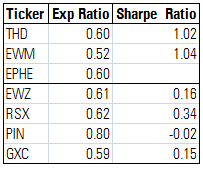
Figure 9 shows the total return for each calendar year from 2007 through YTD 2012 (as of 08/31/2012). The select country ETFs have done better in 2010, 2011 and YTD 2012. It was a mixed bag in 2009. It is necessary to go back to earlier figures in this article to get a feel for 2007-2009.
Figure 9: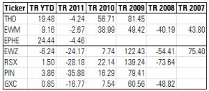
Figure 10 shows the 12-month trailing valuation multiples for the ETFs as of 09/31/2012.
Figure 10: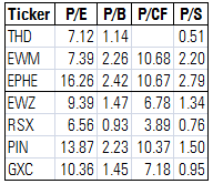
Figure 11 uses forward data from Morningstar; 5-year forward earnings growth rate, forward price to cash flow, and forward price to earnings; and the ratio of the forward multiples to the 5-year projected earnings growth rate.
The select countries are generally more expensive on a forward projection basis, which we contrast to the price trend directions. While more expensive, they are not expensive in an absolute sense and are similar to the valuations for the S&P 500 shown as the last line in Figure 11.
Figure 11: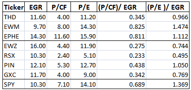
Liquidity:
The Thailand and Malaysia ETFs are liquid, but the Philippines ETF is not.
Figure 12 shows the percent allocation to the top ten holdings in each ETF, the portfolio turnover rate and the net assets of each ETF.
Figure 12: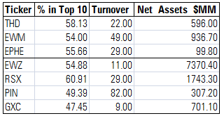
Disclosure: QVM is long THD, EWM and/or EPHE is some accounts.
