- Two key charts reveal troubling signs for equities in 2025.
- A negative risk premium and overexposed fund managers raise red flags.
- 2025 promises to be a volatile year for stocks.
In investing, charts can feel like weather forecasts—sometimes they predict a tempest, and other times, just a drizzle. But right now, two key indicators are flashing warnings that even seasoned investors shouldn't ignore.
These charts highlight troubling signals: the prospective equity risk premium and fund managers’ positions in equities. Together, they paint a picture that should concern investors.
1. The Risk Premium: When Equities Lose Their Edge
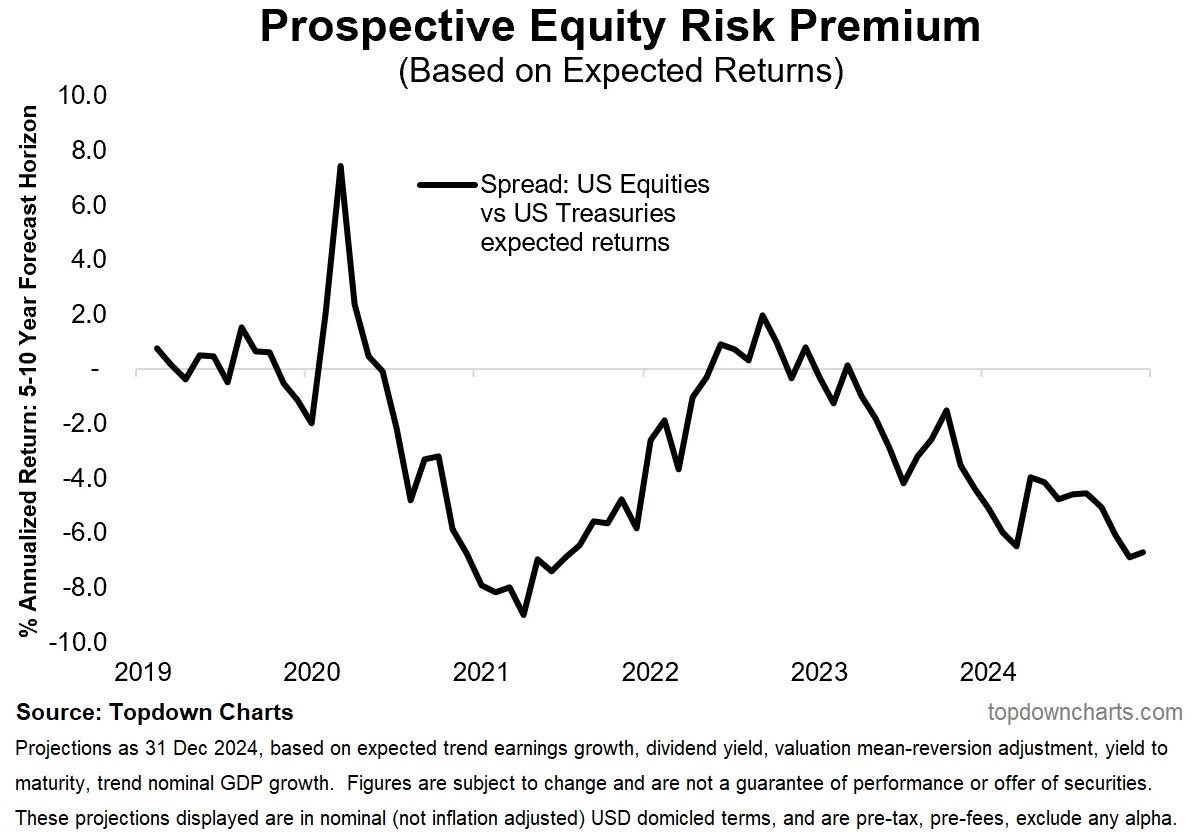
The first chart tracks the "Prospective Equity Risk Premium" (ERP), which measures the difference between expected returns on U.S. equities and the safer option: Treasuries. In theory, investors take on the volatility of equities for the promise of better returns. But here’s the twist—over the last few years, the ERP has dipped below zero. This means Treasuries, often dismissed as boring, could outshine equities over a 5-10 year horizon.
Why does this matter? A negative risk premium flips the traditional investing logic on its head. When equities don’t compensate for their additional risk, they lose their appeal. And this isn’t a short-term blip—it’s a trend that’s been building since 2021, with no sign of a reversal anytime soon.
Adding to the irony, investors are hunting for alternatives to Treasuries despite their rising yields, which remain hampered by stubborn inflation. The market is offering a paradox: equities may not be worth the risk, but Treasuries don’t feel like a safe harbor either.
2. Fund Managers: Overexposed and Overconfident?
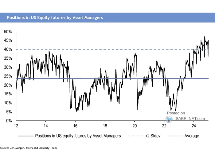
The second chart shifts the spotlight to fund managers' positions in U.S. equity futures. The data reveals a concerning trend: managers are more overexposed to equities than the historical average, approaching levels that typically signal market euphoria.
What’s the risk? When exposure reaches these extremes, markets often respond with a correction—or worse. The dotted line showing the standard deviation is a grim reminder: each time positions have pushed to the upper limits, the market has pulled back. Yet, here we are, dancing dangerously close to the edge again.
Between a Rock and a Hard Place
These two indicators paint a troubling picture for 2025. On one side, a negative risk premium suggests equities aren’t worth the gamble compared to Treasuries. On the other, fund managers’ bullish positioning hints that the market’s optimism may already be baked in—and that a retrenchment could be on the horizon.
So, what’s the move? The best strategy now is to stay grounded and brace for potential turbulence. If these charts teach us anything, it’s that overconfidence is the market’s favorite target.
One thing’s certain: with signals like these, the year ahead promises anything but boredom.
***
Disclaimer: This article is written for informational purposes only. It is not intended to encourage the purchase of assets in any way, nor does it constitute a solicitation, offer, recommendation or suggestion to invest. I would like to remind you that all assets are evaluated from multiple perspectives and are highly risky, so any investment decision and the associated risk is at the investor's own risk. We also do not provide any investment advisory services.

