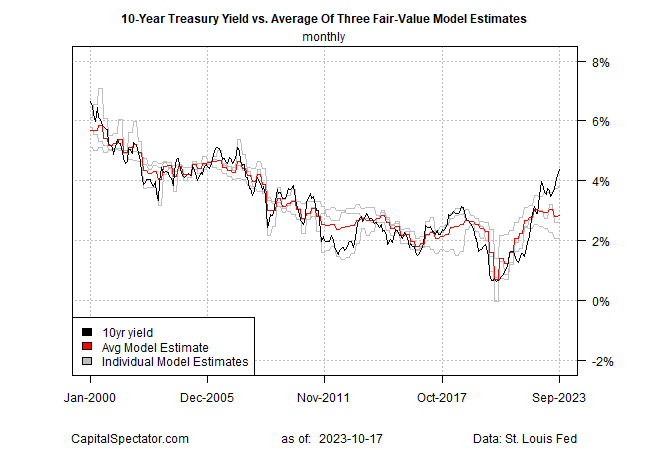
The US 10-year Treasury yield continues to rise, pushing ever higher above CapitalSpectator.com’s “fair-value” estimate, which is based on averaging three models. The trend highlights the limitations of models, at least in the short, for estimating near-term changes in bond yields. But reviewing the recent divergence reminds us that the current spread, although extreme by the standards of recent years, isn’t unprecedented.
The 10-year yield in September rose above 4% (black line in chart below) for the first time since 2008, based on monthly data, which is used in our modeling. By contrast, the average fair-value estimate was essentially unchanged at 2.83% (red line), slightly higher than the previous month.

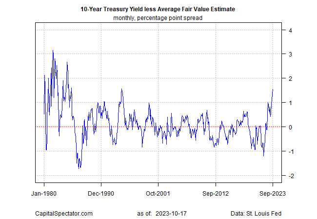
Reviewing the market yield less fair-value estimate emphasizes the extreme degree of divergence in recent history. The September 10-year rate was 1.56 percentage points above the average fair value, the highest spread since 1994.

What’s Driving the Rise in Interest Rates?
Several explanations are popular, including the rise in the term premium:
“The compensation that investors require for bearing the risk that interest rates may change over the life of the bond,” per the New York Fed’s definition.
Some analysts advise that the surge in supply relative to demand for Treasuries is a related factor to the jump in yields (and the commensurate decline in bond prices).
The Economist reports:
“From January to September alone it raised a whopping $1.7 trillion (7.5% of GDP) from markets, up by almost 80% over the same period in 2022, in part because tax revenues have fallen. At the same time, the Fed has been shrinking its portfolio of long-dated Treasuries.”
Alternative theories range from rising doubts about America’s creditworthiness to fears that inflation will stay higher for longer and so the Federal Reserve will be forced to continue lifting interest rates.
Whatever the explanation, the market is pricing the 10-year yield at what appears to be a lofty and arguably unsustainable level. Skeptics can rightly counter that the inputs to our models may not fully capture current events.
At the same time, the spread chart above suggests that the current divergence isn’t unprecedented – far from it. At one point in the early 1980s, the spread briefly topped 3 percentage points — well above the current level.
The spread is now at the 95th percentile, based on history since 1980. That implies that we’re near the peak. The caveat is that events in the months ahead will break precedent and we’re facing an outlier event.
Conclusion
Never say never, but the statistical odds look increasingly favorable for guesstimating that a yield peak is near. In turn, that suggests it’s timely to lift allocations to bonds – especially if current weights are below strategic targets.
At the same time, managing expectations is critical these days. Momentum, after all, has dominated modeling recently and that trend could continue for the foreseeable future.
The spread rise will end eventually, but the uncertainty of when, and why, remains as thick as ever.
