
A rockstar on energy Twitter is Brynne Kelly. She posts great charts regarding interesting price-action and other bits of wisdom. Brynne shared a natural gas chart yesterday that got some folks talking. What I found particularly interesting is how well the chart showcased the biases among individuals (including yours truly).
As a technician and student of behavioral economics, I recognize that it is hard to eliminate one’s biases when trading and analyzing data. I’m as guilty as any, but it is important to be as objective as possible.
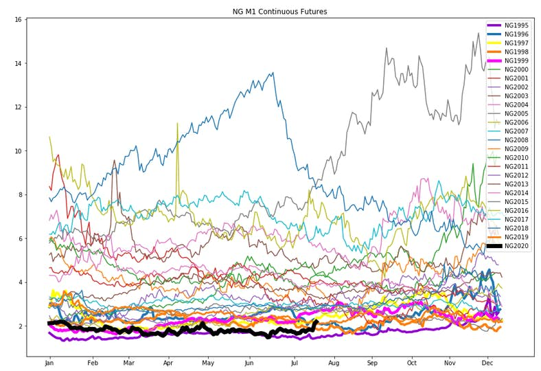
The chart (shown above) is of natural gas prices by year going back to the 1990s. You’ll see that 2020 prices (in black) are near the bottom of the picture – very cheap relative to history. Of course, fundamentals have also changed dramatically in the last 15 years as fracking technology has allowed for much more supply to enter the picture across the U.S. The 2020 prices were in the gutter for much of the spring due to COVID-19 dampening demand, but then came a hot summer and reduced production. Prices have recently jolted higher from $1.50 to $2.25 – a big percentage move, no doubt, but a paltry dollar move compared to history.
Here’s the behavioral bias piece – those with a bullish bias will say, “Look at how high natural gas prices could go from here!” Those with a bearish ‘prior’ comment, “this recent 60% increase – big whoop! The trend is still down.”
Like anything regarding data, what we see is all there is, as Danny Kahneman said so eloquently in Thinking, Fast and Slow. We seek (often subconsciously) to find data and a narrative that makes us feel comfortable. We hate the feeling of being challenged to change our views.