The Department of Transportation's Federal Highway Commission has released the latest report on Traffic Volume Trends, data through September. Travel on all roads and streets changed by 2.3% (5.8 billion vehicle miles) for October 2013 as compared with October 2012. Cumulative Travel for 2013 changed by 0.6% (15.6 billion vehicle miles). Cumulative estimate for the year is 2492.6 billion vehicle miles of travel (see report). Both the civilian population-adjusted data (age 16-and-over) and total population-adjusted data are fractionally above the post-financial crisis lows set in June.
Here is a chart that illustrates this data series from its inception in 1970. I'm plotting the "Moving 12-Month Total on ALL Roads," as the DOT terms it. See Figure 1 in the PDF report, which charts the data from 1988. My start date is 1971 because I'm incorporating all the available data from earlier DOT spreadsheets.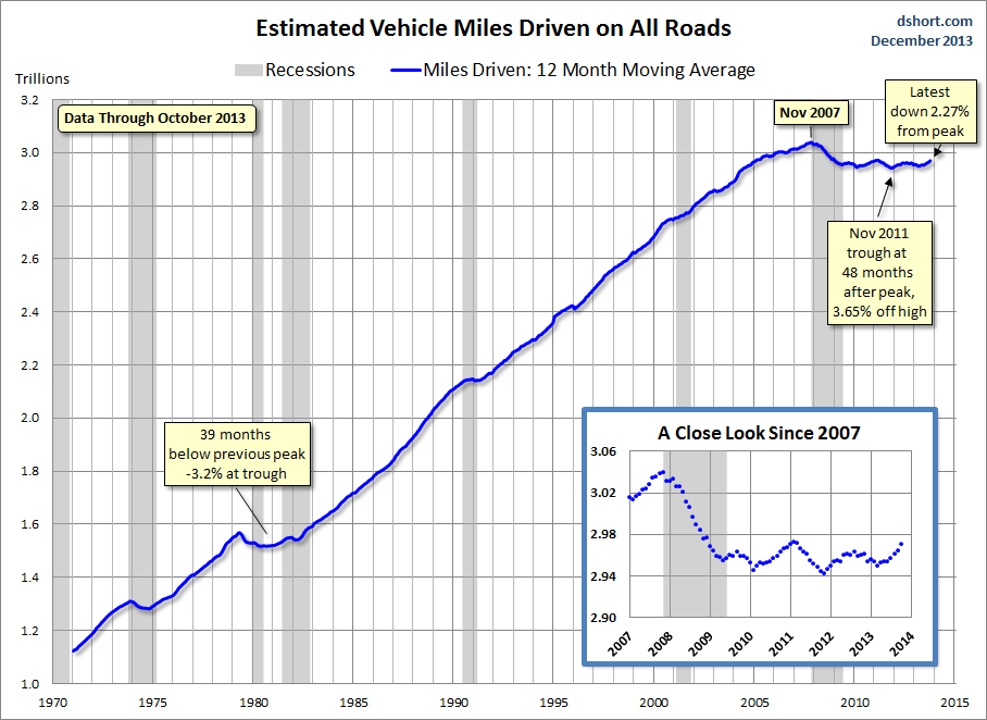
The rolling 12-month miles driven contracted from its all-time high for 39 months during the stagflation of the late 1970s to early 1980s, a double-dip recession era. The most recent decline has lasted for 70 months and counting — a new record, but the trough to date was in November 2011, 48 months from the all-time high.
The Population-Adjusted Reality
Total Miles Driven, however, is one of those metrics that should be adjusted for population growth to provide the most meaningful analysis, especially if we're trying to understand the historical context. We can do a quick adjustment of the data using an appropriate population group as the deflator. I use the Bureau of Labor Statistics' Civilian Noninstitutional Population Age 16 and Over (FRED series CNP16OV). The next chart incorporates that adjustment with the growth shown on the vertical axis as the percent change from 1971.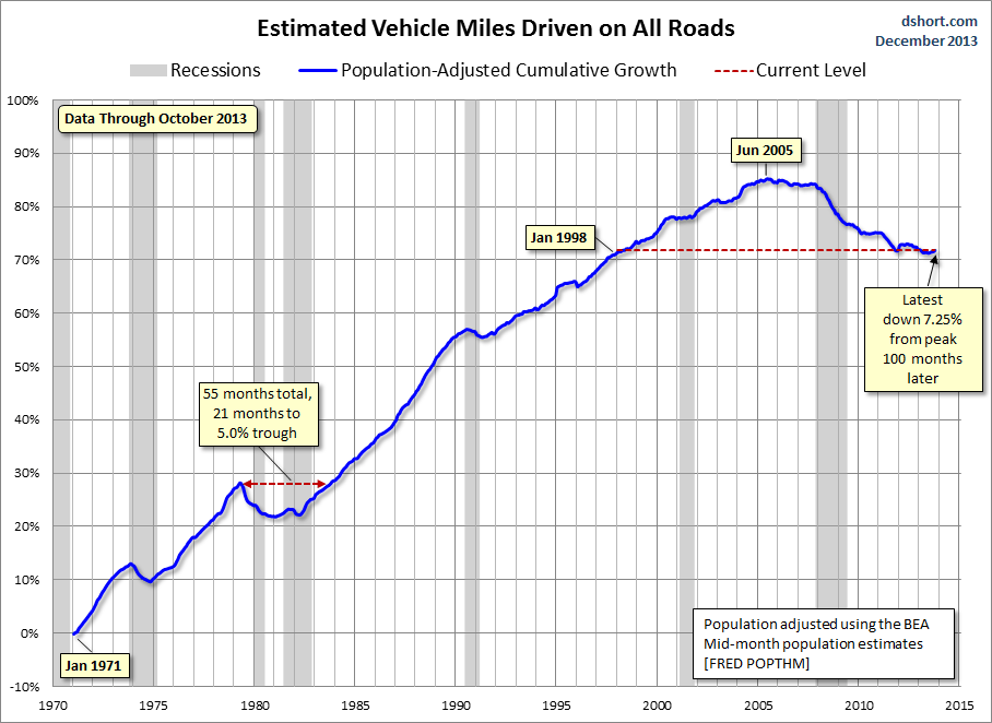
Clearly, when we adjust for population growth, the Miles-Driven metric takes on a much darker look. The nominal 39-month dip that began in May 1979 grows to 61 months, slightly more than five years. The trough was a 6% decline from the previous peak.
The population-adjusted all-time high dates from June 2005. That's 100 months — over eight years ago. The latest data is 8.80% below the 2005 peak, fractionally above the the -9.02% post-Financial Crisis low set in June. Our adjusted miles driven based on the 16-and-older age cohort is about where we were as a nation in January of 1995.
Here is a closer look at the series since 2000. We can see that the decline leveled off in 2010, rolled over in 2011, leveled off in the first half of 2012 and then rolled over again.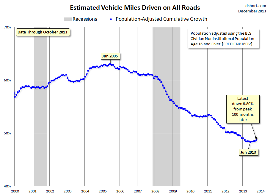
About that Population Adjustment...
I've frequently been asked why I use the CNP16OV data for the population adjustment, often with the suggestion that it would make more sense to limit the population to licensed drivers. For openers, I don't know of a valid source for the driver-licensed population. Moreover, the correlation between license holders and actual drivers is not a reliable one. Many license holders in households do not drive, especially in their older years. According to Census Bureau data on gasoline sales (courtesy of Harry Dent's research on demand curves), dollars spent on gasoline peaks for people in their late 40s and falls off rather quickly after that.
In fact, I think there's a good case for using the Census Bureau's mid-month estimates of total population (POPTHM) rather than civilians age 16 and over for the population adjustment. The reason is that a portion of total miles driven is specifically to support children's needs (day care, schools, children's activities, etc.) and the needs of elders who might have licenses but no longer drive. Ultimately the division of miles driven by either population group (CNP16OV or POPTHM), while not a perfect match with drivers, is a consistent and relevant metric for evaluating economic growth.
Here is the same population-adjusted chart, this time with the total population for the adjustment. In the total-population adjusted version the latest data point of -7.25, a small increase above June's -7.53% post-recession low.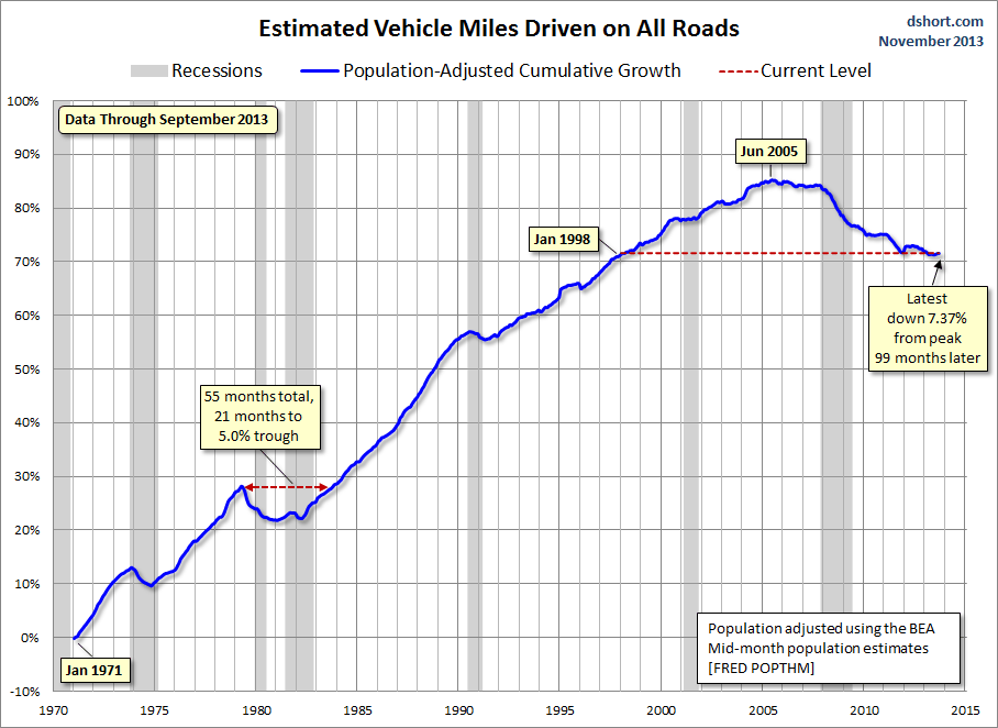
What about the impact of volatile gasoline prices? How much of a factor has that been in the trend? I'll close with an overlay of the population-adjusted miles driven and real (inflation-adjusted) regular gasoline prices (all formulations) since the early 1990s.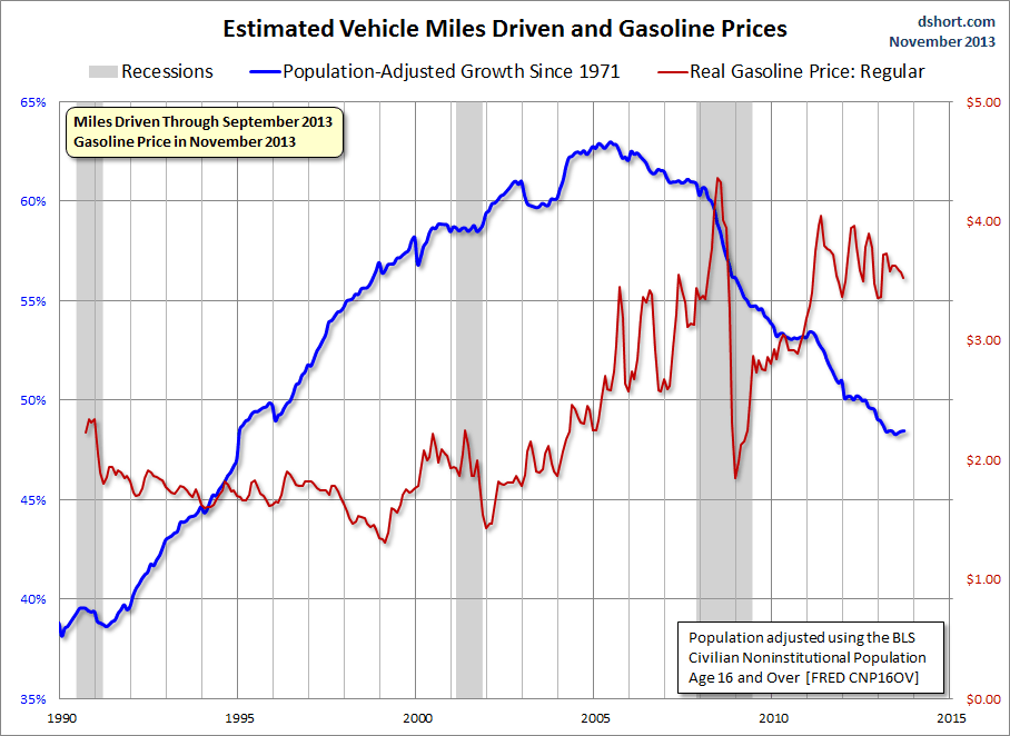
As is readily apparent, the correlation is fairly weak over the entire timeframe. And, despite the volatility in gasoline prices since the onset of the Great Recession, the correlation since December 2007 has been even weaker. There are profound behavioral issues apart from gasoline prices that are influencing miles driven. These would include the demographics of an aging population in which older people drive less, continuing high unemployment, the ever-growing ability to work remote in the era of the Internet and the use of ever-growing communication technologies as a partial substitute for face-to-face interaction.
See the latest study by the Frontier Group, A New Direction: Our Changing Relationship with Driving and the Implications for America's Future (PFD format).
The Driving Boom — a six decade-long period of steady increases in per-capita driving in the United States — is over.
Americans drive fewer total miles today than we did eight years ago, and fewer per person than we did at the end of Bill Clinton's first term. The unique combination of conditions that fueled the Driving Boom—from cheap gas prices to the rapid expansion of the workforce during the Baby Boom generation — no longer exists. Meanwhile, a new generation — the Millennials — is demanding a new American Dream less dependent on driving.
The DOT "miles driven" metric is also interesting to study in the context of gasoline volume sales, which I also update monthly:
- English (UK)
- English (India)
- English (Canada)
- English (Australia)
- English (South Africa)
- English (Philippines)
- English (Nigeria)
- Deutsch
- Español (España)
- Español (México)
- Français
- Italiano
- Nederlands
- Português (Portugal)
- Polski
- Português (Brasil)
- Русский
- Türkçe
- العربية
- Ελληνικά
- Svenska
- Suomi
- עברית
- 日本語
- 한국어
- 简体中文
- 繁體中文
- Bahasa Indonesia
- Bahasa Melayu
- ไทย
- Tiếng Việt
- हिंदी
Vehicle Miles Driven: 4th Month Of Population-Adjusted Increases
Published 12/23/2013, 12:35 AM
Updated 07/09/2023, 06:31 AM
Vehicle Miles Driven: 4th Month Of Population-Adjusted Increases
Latest comments
Loading next article…
Install Our App
Risk Disclosure: Trading in financial instruments and/or cryptocurrencies involves high risks including the risk of losing some, or all, of your investment amount, and may not be suitable for all investors. Prices of cryptocurrencies are extremely volatile and may be affected by external factors such as financial, regulatory or political events. Trading on margin increases the financial risks.
Before deciding to trade in financial instrument or cryptocurrencies you should be fully informed of the risks and costs associated with trading the financial markets, carefully consider your investment objectives, level of experience, and risk appetite, and seek professional advice where needed.
Fusion Media would like to remind you that the data contained in this website is not necessarily real-time nor accurate. The data and prices on the website are not necessarily provided by any market or exchange, but may be provided by market makers, and so prices may not be accurate and may differ from the actual price at any given market, meaning prices are indicative and not appropriate for trading purposes. Fusion Media and any provider of the data contained in this website will not accept liability for any loss or damage as a result of your trading, or your reliance on the information contained within this website.
It is prohibited to use, store, reproduce, display, modify, transmit or distribute the data contained in this website without the explicit prior written permission of Fusion Media and/or the data provider. All intellectual property rights are reserved by the providers and/or the exchange providing the data contained in this website.
Fusion Media may be compensated by the advertisers that appear on the website, based on your interaction with the advertisements or advertisers.
© 2007-2025 - Fusion Media Limited. All Rights Reserved.
