Each week I consider the upcoming calendar and the current market, predicting the main theme we should expect. This step is an important part of my trading preparation and planning. It takes more hours than you can imagine. My record is pretty good, with recent topics including Fedspeak, increased volatility, and a focus on interest rates – all very accurate.
Sometimes there is no clear theme, and I try to be honest about that. In the past I have described it as a "lull before the storm" and as "waiting for evidence." This week I see an absence of major new data. At the same time the markets are at a crucial point for both technicians and traders. That is the main reason for the recent volatility. I see the following key questions?
- Is this a potential tipping point for markets – both bonds and stocks?
- What is the real "new normal?"
Prof. DeLong also did a great job as organizer of the recent Kauffman Conference – helpful both to me and to many others. (More on that to come). This week he wrote an excellent post that is very important for investors. Since it is long and wonkish, it will not get read by those who need the information the most—investors! What if I said that it was the most important post I saw this week –out of the hundreds that I review each week?
My job is to summarize such information, but it is a challenge with this piece. It includes a survey of what is unusual and an analysis of paths to normalization.
So here is the summary: This is not simple! The media buzz you are getting is not just uninformative, it is wrong. The various discrepancies in labor force participation, government debt, and regulation will be resolved, but the path is not clear.
I have my own thoughts on the real "new normal" which I'll report in the conclusion. First, let us do our regular update of last week's news and data.
Background on "Weighing the Week Ahead"
There are many good lists of upcoming events. One source I regularly follow is the weekly calendar from Investing.com. For best results you need to select the date range from the calendar displayed on the site. You will be rewarded with a comprehensive list of data and events from all over the world. It takes a little practice, but it is worth it.
In contrast, I highlight a smaller group of events. My theme is an expert guess about what we will be watching on TV and reading in the mainstream media. It is a focus on what I think is important for my trading and client portfolios.
This is unlike my other articles, where I develop a focused, logical argument with supporting data on a single theme. Here I am simply sharing my conclusions. Sometimes these are topics that I have already written about, and others are on my agenda. I am putting the news in context.
Readers often disagree with my conclusions. Do not be bashful. Join in and comment about what we should expect in the days ahead. This weekly piece emphasizes my opinions about what is really important and how to put the news in context. I have had great success with my approach, but feel free to disagree. That is what makes a market!
Last Week's Data
Each week I break down events into good and bad. Often there is "ugly" and on rare occasion something really good. My working definition of "good" has two components:
- The news is market-friendly. Our personal policy preferences are not relevant for this test. And especially -- no politics.
- It is better than expectations.
This was a mixed week for economic data, but the most important reports were positive.
- The employment report beat expectations. Job gains did not run high enough to stimulate Fed Fear. The market celebrated the news, but those paying attention understand the shortcomings:
- Gene Epstein, writing in Barron's, sees a recovery as at least a year away. That merely extrapolates the current growth rate without adjusting for changes in the work force.
- The pace of net job gains is not fast enough (although a recent study suggests that anything over 80K cuts unemployment (via GEI).
- Other employment indicators were not as strong. Regular readers know that I like to view the BLS as one of several sources. I am delighted to read Goldman Sachs economist Jan Hatzius says the same. See the helpful article from Cardiff Garcia.
- The wage increases are lagging job gains (See Martin Hutchinson at Breakingviews).
- Mortgage debt is down and household net worth is higher. Calculated Risk analyzes the latest Federal Reserve Flow of Funds report. We should note, however, that the gains are skewed to the upper end of the wealth and income ranges.
- CFOs are optimistic about the U.S. economy according to the quarterly Duke survey. The Optimism Index rating of 61 is a rebound from last quarter's 55 and above the long-term average of 59. Latin American and Asian CFOs are even more positive. Despite this, spending plans are only modestly higher. There are a number of interesting findings here, so it is well worth checking out.
- The IMF recognizes excessive austerity in Europe. More economic growth in Europe would help everyone.
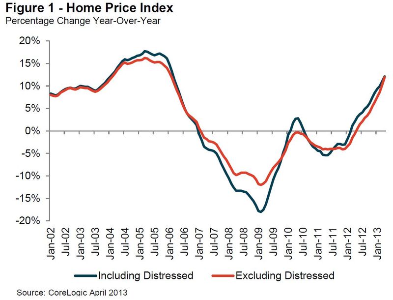
- Home prices show strong gains from the CoreLogic NSA series. Calculated Risk is the place to monitor the housing rebound, where Bill McBride writes as follows:
This is the largest year-over-year increase since 2006."
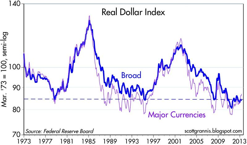
The dollar is getting stronger on a trade-weighted basis. Dr. Ed has the story and this chart:
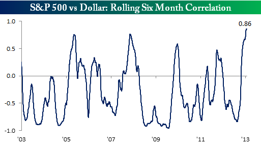
And the inverse correlation of stocks with the dollar has reversed quite sharply (via Bespoke). Here is the key chart, but check out the article for discussion and analysis. This change has been a major surprise for many, especially those who love to overuse the word, "debase."
The Bad
There was also plenty of bad news.
- The Hindenburg Omen is back! Look out below, since it has been confirmed. Three years ago I explained that this indicator was the poster boy for a bad research method – widely followed by those with multi-year forecasts of recessions and "worst times" to invest. A twitter friend suggested that I should also mention that some see it as an "alert" rather than a prediction. Read the explanation and see if you find it helpful. MarketWatch's "The Tell" has the right conclusion:
"Either way, the HO this past week showed how much attention you can garner with an ominous sounding name in times of market skittishness, and generated its share of Tweets." - China's flash PMI was below 50. The market seemed to shrug this off on Monday morning, but we should still watch Chinese economic growth carefully.
- The ISM index was 49, down from 50.7 last month. The ISM sees this as consistent with GDP growth of 2.1% based upon historical data. (We are in a trend of manufacturing lagging overall growth). Many believe that their research on this relationship needs updating.
- The sequester effects are starting to hit. The effect is probably about 0.5% in GDP (via Rick Newman at The Exchange).
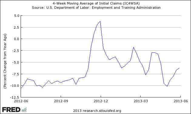
- Initial jobless claims have broken the bullish trend. I know that last week's number was a little better than expectations. I also know that a really good number dropped out of the four-week moving average. Steven Hansen at Global Economic Intersection takes a deeper look. He compares the current moving average (which is everyone's top choice to reduce the noise in the series) and compares it to the prior year. Both are seasonally adjusted. See the entire article for discussion and several good charts, but here is an important one:
Fed speeches included discussions of how the current QE purchases might be tapered off. The "T" word has replaced the "R" word as the newest fear factor. The trader perception, parroted regularly on CNBC, now includes the idea that the Fed somehow orchestrated this mixed message to create ambiguity. Do these "experts" think that all of the meeting transcripts and minutes are faked? They have absolutely no idea about how government decisions are reached. The simple and incorrect meme about the Fed is taken far too seriously. It is obviously time for another article on this theme. Meanwhile, get ready for some selling whenever one of the "hawks" gives a speech, whether or not he is a voting member.
The Ugly
This week's "ugly" award goes to the Illinois legislature. The session ended with no solution to the ever-expanding public pension problem – the most under-funded in the country. This is an issue that is not going away and gets worse with the passage of time. The immediate result was a downgrade of the state's debt rating. The legislature did approve turning the Elgin – O'Hare expressway (which goes neither to Elgin nor O'Hare) into a toll road.
One might expect a state where one party controls the governor's office as well as both houses of the legislature to be capable of needed actions. Illinois politics are different, with cross-cutting factions representing Chicago, the suburbs, and downstate interests as well as the two parties. One successful bill combined a downstate fertilizer plant with a new arena for DePaul's basketball team – not close to campus but near McCormick Place.
The Governor has called for a special legislative session on the pension issue, but it will take a major new ingredient to break the logjam.
This story is something to keep in mind when we revisit the debt limit and sequestration issues later this year.
The Indicator Snapshot
It is important to keep the current news in perspective. My weekly snapshot includes the most important summary indicators:
- The St. Louis Financial Stress Index.
- The key measures from our "Felix" ETF model.
- An updated analysis of recession probability.
The SLFSI is not a market-timing tool, since it does not attempt to predict how people will interpret events. It uses data, mostly from credit markets, to reach an objective risk assessment. The biggest profits come from going all-in when risk is high on this indicator, but so do the biggest losses.
The C-Score is a weekly interpretation of the best recession indicator I found, Bob Dieli's "aggregate spread." I have now added a series of videos, where Dr. Dieli explains the rationale for his indicator and how it applied in each recession since the 50's. I have organized this so that you can pick a particular recession and see the discussion for that case. Those who are skeptics about the method should start by reviewing the video for that recession. Anyone who spends some time with this will learn a great deal about the history of recessions from a veteran observer.
I have promised another installment on how I use Bob's information to improve investing. I hope to have that soon. Meanwhile, anyone watching the videos will quickly learn that the aggregate spread (and the C Score) provides an early warning. Bob also has a collection of coincident indicators and is always questioning his own methods.
I also feature RecessionAlert, which combines a variety of different methods, including the ECRI, in developing a Super Index. They offer a free sample report. Anyone following them over the last year would have had useful and profitable guidance on the economy. RecessionAlert has developed a comprehensive package of economic forecasting and market indicators, well worth your consideration.
Georg Vrba's four-input recession indicator is also benign. "Based on the historic patterns of the unemployment rate indicators prior to recessions one can reasonably conclude that the U.S. economy is not likely to go into recession anytime soon." Georg has other excellent indicators for stocks, bonds, and precious metals at iMarketSignals.
Unfortunately, and despite the inaccuracy of their forecast, the mainstream media features the ECRI. Doug Short has excellent continuing coverage of the ECRI recession prediction, now over 18 months old. Doug updates all of the official indicators used by the NBER and also has a helpful list of articles about recession forecasting. His latest comment points out that the public data series has not been helpful or consistent with the announced ECRI posture. Doug also continues to refresh the best chart update of the major indicators used by the NBER in recession dating.
This week there is (yet another) effort by the ECRI to suggest that there might be a recession. Doug Short notes as follows:
"Here are two significant developments since ECRI's public recession call on September 30, 2011:
- The S&P 500 is up about 40%.
- The unemployment rate has dropped from 9.0% to 7.6%."
Readers might also want to review my Recession Resource Page, which explains many of the concepts people get wrong.
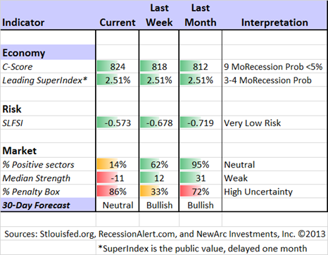
Our "Felix" model is the basis for our "official" vote in the weekly Ticker Sense Blogger Sentiment Poll. We have a long public record for these positions. This week we switched to a neutral forecast. These are one-month forecasts for the poll, but Felix has a three-week horizon. Felix's ratings have been weakening over the last two weeks, and dropped significantly this week. The penalty box percentage measures our confidence in the forecast. A high rating means that most ETFs are in the penalty box. When that measure is elevated, we have less confidence in short-term trading.
[For more on the penalty box see this article. For more on the system ratings, you can write to etf at newarc dot com for our free report package or to be added to the (free) weekly ETF email list. You can also write personally to me with questions or comments, and I'll do my best to answer.]
The Week Ahead
After two weeks with plenty of data, the coming week's calendar is a little light.
The "A List" includes the following:
- Initial jobless claims (Th). Employment will continue as the focal point in evaluating the economy, and this is the most responsive indicator.
- Michigan Sentiment (F). Sentiment is a good coincident indicator for employment and consumer activity.
- Retail Sales (Th). The consumer is still a big story.
- Industrial production (F). This remains a key factor in overall economic health.
- PPI (F). This will be important at some point, but there is no sign of inflation so far. A calendar quirk means that we will not see the PPI and CPI on consecutive days, as is most often the case.
Trading Time Frame
Felix has switched to a neutral posture, now fully reflected in trading accounts. We have no position in equities. Our partial position includes a bond inverse fund and a commodity.
The overall ratings are slightly negative, so we were close to an outright bearish call. This could easily be the case by the end of next week. While it is a three-week forecast, we generate a new forecast every day.
It is fair to say that Felix is cautious about the next few weeks. Felix did well to avoid the premature correction calls that have been prevalent since the first few days of 2013, accompanied by various slogans and omens.
Investor Time Frame
Each week I think about the market from the perspective of different participants. The right move often depends upon your time frame and risk tolerance. Too many individual investors check in only occasionally and then make dramatic decisions based upon slender evidence. That is especially wrong right now.
This is a time of danger for investors – a potential market turning point. My recent themes are still quite valid. If you have not followed the links, find a little time to give yourself a checkup. You can follow the steps below:
- What NOT to do
- Find a safer source of yield: Take what the market is giving you!
- Balance risk and reward
Three years ago, in the midst of a 10% correction and plenty of Dow 5000 predictions, I challenged readers to think about Dow 20K. I knew that it would take time, but investors waiting for a perfect world would miss the whole rally. In my next installment on this theme I reviewed the logic behind the prediction. It is important to realize that there is plenty of eventual upside left in the rally. To illustrate, check out Chuck Carnevale's bottoms-up analysis of the Dow components showing that the Dow "remains cheaply valued."
- Get Started
We have collected some of our recent recommendations in a new investor resource page -- a starting point for the long-term investor. (Comments and suggestions welcome. I am trying to be helpful and I love feedback).
Final Thought
What will be the new normal? How will the wide gap between the valuation of stocks and bonds be resolved?
My own answer has been that the two will converge. Interest rates and stock prices will both move higher. At the start of 2011 I predicted ten things that would be more normal. Some have proved accurate while others are a work in progress.
My 2010 forecast of Dow 20K is also proving out – and for the right reasons. You can check out the history, reasons, and progress toward this goal at our new investor resource page. If you are skeptical of the conclusion, you will be just like those who raised doubts three years ago. Why not check out the reasons?
Dow 150,000? I feel like a real piker when compared with Michael Gouvalaris, who takes a long-term technical viewpoint. Here is his key chart:
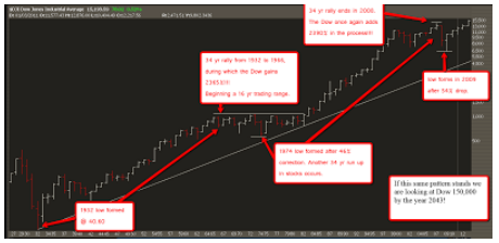
Well! 2043 is outside of my regular forecasting range, but the concept is sound. Mike writes as follows:
"…(T)he markets will always favor the upside over the long term because of pure math. The downside risk is 100%, that is the worst case scenario. While your upside is unlimited. We just saw two separate cases of long term macro bull markets that produced over 2000% returns while the declines maxed out at around 55%. Do you see where I am going with this? Institutions adopt this mindset, they look at the 2000% upside over time after a historically oversold decline, as opposed to the downside risks in the short term. It's easy to blame the PPT, the Fed and a whole plethora of others for market rallies in the face of "headlines" and slow data. Ironically it is almost always the same ones that have gotten monetary policy, QE, fiscal policy etc, completely wrong from the very start."
Makes sense to me!
