If we compare the Dow Jones Index to silver, we can spot a troubling trend. Normally when a stock price or index increases, so does the trading volume. This was true for the Dow Jones Index from 2002-2009. If we look at the chart below, we can see a normal market… increasing stock value and subsequent trading activity:
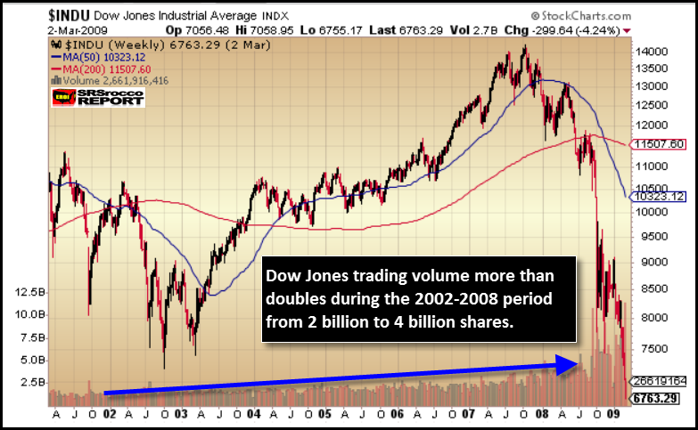
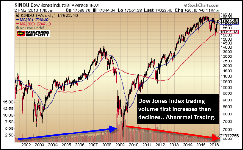
As the Dow Jones Industrial Average increased from a low of 7,500 in 2002 to over 14,000 in 2007, its trading volume doubled. However, if we look at the next chart, we see a troubling sign. As the Dow Jones Index increased from 8,000 in early 2009 to over 18,000 in 2015, its trading volume is currently 2+ times lower:
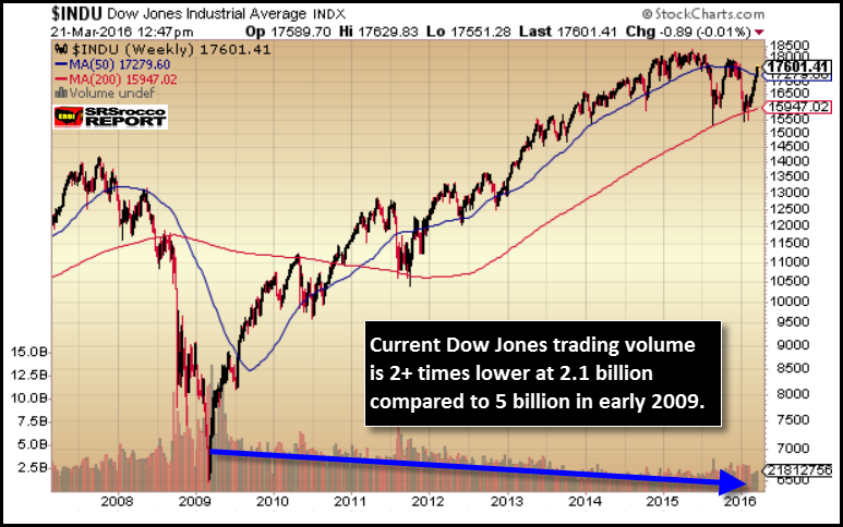
This is not a new concept as many analysts have been pointing this out over the past several years. However the truth remains, the Dow Jones Index is being propped up by declining number of market participants. So, who has the leverage to prop up a market with less overall volume? Well, of course its the Fed and U.S. Treasury.
On the other hand, if we look at the silver chart we see a much different picture:
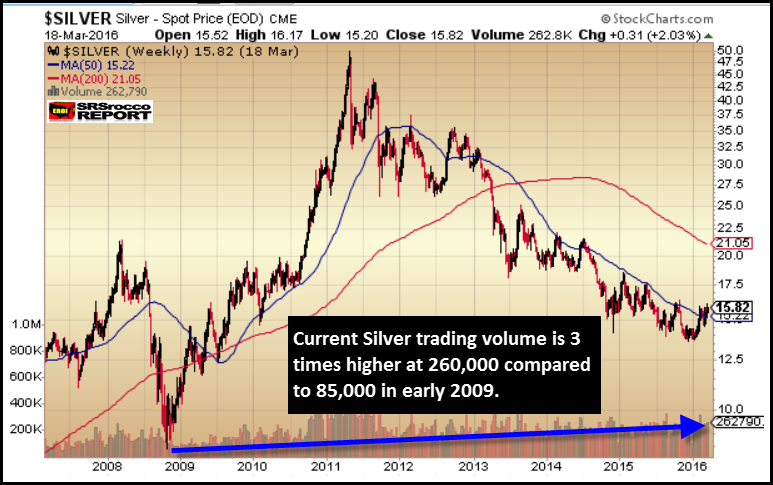
Trading volume for silver continues to increase from its low in 2009…. even at a lower price. Part of the reason here has to do with new exchanges opening up and joining the silver trading bandwagon. Regardless, trading volume for silver has been increasing in a steady fashion since 2002:
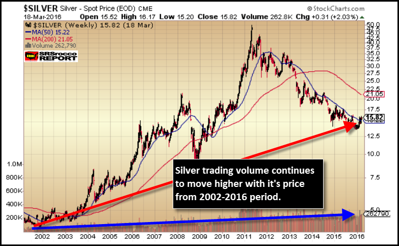
Even though silver enjoyed a huge price spike and correction (2010-2013), its overall trend is still higher… so is its trading volume. Thus, the silver Chart shows a healthy combination of increased price and trading volume. However, the Dow Jones Index has the BEST & WORST trading volume activity in the chart below:
As the markets continue to become more manipulated and rigged each passing day, at some point market fundamentals will matter. Once this occurs, which market would you rather be in?? The Dow Jones index, or silver?
